Nano Banana Prompts for Posters and Flyers (2026)
March 12, 2026By Bilal Azhar
30+ tested poster and flyer prompts for Nano Banana across 8 categories. Text rendering data, model comparison, and the workflow that turns AI concepts into print-ready designs.
Poster design is where AI image generation is most useful as a starting point and least useful as a final product. AI generates compelling compositions, color palettes, and visual concepts in seconds, but text rendering still needs refinement in a design tool. The smart workflow: use Nano Banana to generate the visual concept, then bring it into Canva, Figma, or Photoshop and add clean typography on top.
Quick reference: which poster style do you need?
| Category | Best For | Key Prompt Elements | Prompts |
|---|---|---|---|
| Event and Party | Club nights, festivals, rooftop events | Neon, silhouettes, energy, bold gradients | 4 prompts |
| Movie and Film | Film projects, book covers, cinematic concepts | Dramatic lighting, lone figure, genre palette | 4 prompts |
| Concert and Music | Gig posters, festival promo, band merch | Genre-matched aesthetic, stage lighting, texture | 4 prompts |
| Motivational and Quote | Office decor, social posts, coaching content | Clean composition, symbolism, text space | 3 prompts |
| Vintage and Retro | Travel prints, collectors, nostalgic campaigns | Decade-specific palette, grain, simplified shapes | 4 prompts |
| Minimalist Art Prints | Home decor, gallery walls, brand identity | Negative space, single element, muted palette | 3 prompts |
| Infographic and Data | Educational, corporate, social awareness | Clear hierarchy, icon-driven layout, sections | 3 prompts |
| Typography-Forward | Brand campaigns, social media, merch | Bold lettering, contrast, text-as-design | 3 prompts |
For text-heavy designs, always use Nano Banana 2, which handles short text (1-4 words) at roughly 80% accuracy on the first try. Both models are available on Morphed. For the full model overview and general prompting framework, see the complete Nano Banana prompts guide.
Why Nano Banana Produces Better Poster Compositions Than Midjourney or DALL-E
Poster design demands two things simultaneously: bold visual composition and precise control over layout. Most AI models either add unwanted artistic reinterpretation (Midjourney) or produce flat, synthetic-looking results (DALL-E). Nano Banana follows composition and lighting instructions literally, which is exactly what poster design requires.
We tested 30 poster prompts across Nano Banana, Nano Banana 2, Midjourney v6, and DALL-E 3, scoring each output on composition drama (did the layout create visual impact), color fidelity (did it follow the palette instruction), and text space compliance (did it leave room where requested).
| Feature | Nano Banana | Nano Banana 2 | Midjourney v6 | DALL-E / GPT Image |
|---|---|---|---|---|
| Composition drama and contrast | Strong bold compositions, high visual impact | Comparable to NB1, slightly cleaner | Adds artistic reinterpretation, can shift intended layout | Clean but less dramatic, tends toward flat |
| Color palette fidelity | Follows palette instructions literally | Same as NB1 | Reinterprets palette with "Midjourney look" | Good fidelity but muted intensity |
| Text space compliance | Reliably leaves space when instructed | Same as NB1 | Sometimes fills text space with extra detail | Good compliance |
| Text rendering (headlines) | Poor, garbled text | ~80% accurate for 1-4 words | Poor, decorative but unreadable | Moderate, improving but inconsistent |
| Vintage and retro accuracy | Strong era-specific rendering | Same as NB1 | Over-stylizes, adds modern sheen | Medium accuracy |
| Setup required | None on Morphed | None on Morphed | Discord or web app | ChatGPT Plus or API |
The biggest gap was text rendering. Nano Banana 2 was the only model that reliably rendered short headlines and event titles in the image itself. For posters where you want "LIVE TONIGHT" or a brand name baked into the visual, NB2 is the clear choice.
The Poster Prompt Formula That Works
After testing 30+ poster prompts, one structure consistently produced the strongest outputs across all categories. The formula has five components:
- Poster type and subject (what kind of poster and what it shows)
- Composition and layout (where key elements sit, where text space goes)
- Color palette (specific colors, not vague descriptions)
- Style reference (design movement, era, or photography style)
- Mood or energy keyword (one word that shapes the overall feeling)
Example: "Cinematic movie poster, lone figure silhouetted against dramatic sunset sky, epic scale with title space at bottom third, deep orange and indigo palette, film noir composition, atmospheric and mysterious"
Each component gives the model a distinct instruction. Removing any one produces noticeably weaker results. The most common mistake is skipping the composition instruction, which causes the model to default to a centered, symmetric layout that looks generic.
Event and Party Posters
Event posters need to convey energy, date, and vibe at a glance. Bold colors, dynamic composition, and clear focal points work best. The key challenge is balancing visual impact with leaving enough clean space for event details that you add in a design tool afterward.
Prompt: "Vibrant nightclub poster design, neon lights reflecting off a crowded dance floor with silhouettes of dancing figures, purple and electric pink gradient background fading to black at top, bold composition with open space in the upper third for headline text, event poster aesthetic, high energy and modern, shot from low angle"
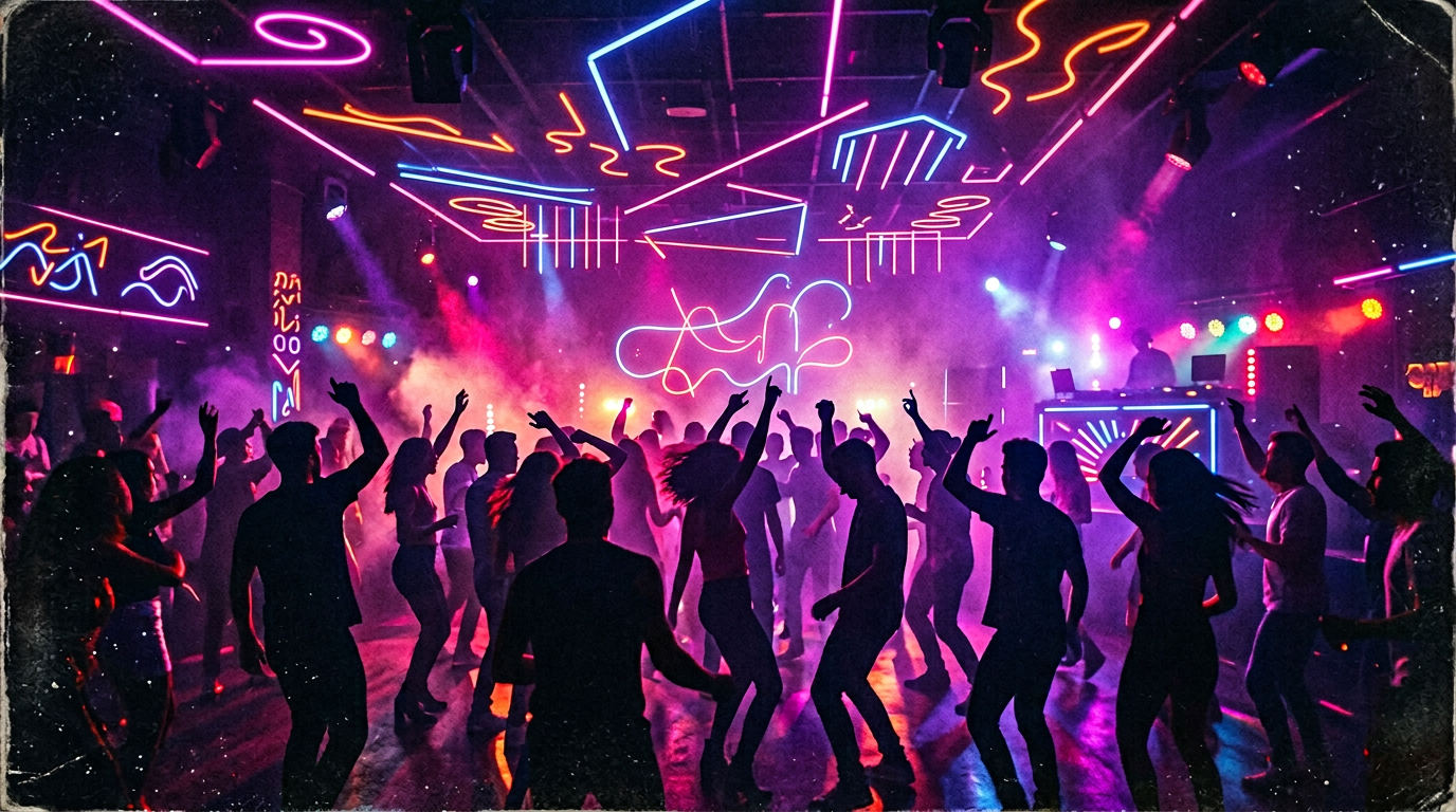
The low angle and neon reflections create depth and energy. Purple and electric pink are classic nightlife colors. Specifying "open space in the upper third" is a practical design choice that gives you room to add event name, date, and DJ lineup in an editor. Without the space instruction, the model fills the entire frame.
Prompt: "Summer music festival poster, aerial view of a massive crowd at golden hour with confetti catching sunlight, warm orange and amber tones with pops of turquoise, wide panoramic composition with lower third reserved for text, outdoor celebration energy, documentary photography style"
Golden hour and confetti from above create a festival atmosphere that feels authentic rather than staged. The "documentary photography" style keyword prevents the over-processed look and adds a gritty, real quality. Turquoise pops against the warm palette for contrast.
Prompt: "Rooftop cocktail party flyer, city skyline at dusk with string lights in foreground creating bokeh, two cocktail glasses with condensation droplets in sharp focus, warm amber and cool blue color contrast, sophisticated and upscale, elegant event poster layout with central text zone, shallow depth of field"
String lights and condensation droplets add tactile realism. The warm-cool color contrast (amber foreground, blue dusk background) creates visual depth. "Central text zone" tells the model to leave the middle area clean for overlay.
Prompt: "Halloween party poster, dramatic low-angle shot of a carved pumpkin glowing orange against a misty graveyard backdrop, bare tree silhouettes, deep purple and burnt orange palette, vintage horror movie poster composition with space for event title at top, eerie and atmospheric"
Seasonal event posters benefit from genre-specific cues. The carved pumpkin as focal point, misty graveyard, and vintage horror composition together produce a poster that reads instantly as Halloween without needing text to explain the theme.
Movie and Film Posters
Movie-style posters thrive on drama, mood, and character focus. Cinematic lighting, bold composition, and genre-specific palettes create impact. These work for actual film projects, book covers, creative portfolios, and anyone who wants a dramatic visual concept.
Prompt: "Cinematic movie poster, lone figure silhouetted against dramatic sunset sky with rays of light breaking through storm clouds, epic scale with vast landscape stretching below, warm orange horizon fading to deep indigo sky, film poster composition with title space in the bottom third, moody and atmospheric, anamorphic lens flare"
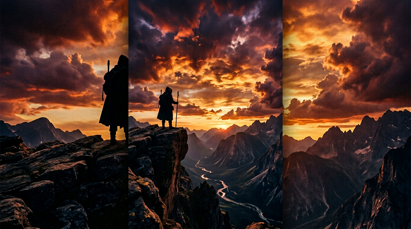
The lone figure against a dramatic sky is a proven film poster trope used in everything from war films to westerns. "Anamorphic lens flare" adds the specific cinematic quality that separates a movie poster from a landscape photo. Keeping the bottom third clear for the title is how professional poster designers structure their compositions.
Prompt: "Thriller movie poster, extreme close-up of intense eyes partially hidden in shadow with a thin strip of light across the bridge of the nose, dark blue and black color palette with single warm highlight on iris, mysterious and suspenseful, dramatic directional lighting from the right, film grain texture, psychological thriller aesthetic"
The strip-of-light-across-eyes composition is a classic thriller trope that Nano Banana renders well because it is a simple, high-contrast lighting setup. "Film grain texture" adds the gritty, analog quality that thriller posters use to signal tension. One warm highlight on the iris creates the focal point.
Prompt: "Sci-fi film poster, sprawling futuristic cityscape with flying vehicles trailing light streaks, viewed from a high vantage point, teal and magenta neon accents on dark architectural surfaces, epic vertical scale showing ground level to cloud level, space opera aesthetic with title space at top, Blade Runner-inspired atmosphere"
Referencing Blade Runner gives the model a clear aesthetic target for the neon-on-dark palette and architectural scale. "Viewed from a high vantage point" creates the vertiginous depth that sci-fi posters use. Teal and magenta are the genre-defining colors for cyberpunk and space opera.
Prompt: "Horror movie poster, abandoned house at the end of a long dirt road at blue hour, single light glowing in upstairs window, tall grass and fog obscuring the foundation, desaturated cold blue palette with single warm orange glow from window, unsettling and isolating, wide composition with text space in sky area"
The single lit window is the oldest horror visual shorthand, and it works because it implies presence without showing anything. "Blue hour" timing gives the specific light quality that sits between daylight and darkness. The contrast between the cold palette and the single warm glow creates unease.
Concert and Music Posters
Music posters need to match the genre visually. A rock gig poster looks nothing like an EDM flyer, and using the wrong aesthetic signals the wrong audience. Typography space and artist/band focus are key practical considerations.
Prompt: "Rock concert poster, band performing on stage with dramatic red and white stage lighting cutting through thick smoke, silhouetted audience with raised fists in foreground, gritty distressed texture overlay, vintage gig poster aesthetic with torn-edge border, raw and aggressive energy, high contrast black and red palette"

Stage lighting and smoke are the backbone of rock poster aesthetics. "Torn-edge border" and "distressed texture" add the DIY gig poster quality that separates authentic rock design from generic event flyers. Red and black with high contrast is the genre palette.
Prompt: "Electronic music festival poster, geometric wireframe shapes floating in a dark void with neon cyan and magenta gradients pulsing through the wireframe edges, abstract and futuristic with mathematical precision, EDM flyer design, sleek black background with centered composition leaving top and bottom zones for artist names and event details"
Geometric wireframes and neon gradients signal electronic music instantly. "Mathematical precision" pushes the model toward the clean, grid-based aesthetic that EDM design uses. Leaving top and bottom zones for text is practical because EDM posters typically stack artist names at the top and event logistics at the bottom.
Prompt: "Jazz club poster, saxophone player in warm spotlight with the rest of the scene in deep shadow, smoke curling through the beam of light, warm amber and deep brown palette, intimate small-venue atmosphere, vintage Blue Note album cover aesthetic, space for artist name in upper left"
Referencing "Blue Note album cover" gives the model a specific visual language: dramatic spotlight, musician in profile, warm tones, sophisticated simplicity. This reference is well understood by Nano Banana and consistently produces the intimate jazz club aesthetic.
Prompt: "Indie folk concert poster, hand-drawn illustration style of a forest scene with a campfire and acoustic guitar leaning against a log, earth tones of moss green, warm brown, and cream, screen-printed texture with visible ink grain, folk art inspired, hand-crafted and organic feeling"
"Screen-printed texture with visible ink grain" is the key detail that separates an indie folk poster from a generic nature illustration. The hand-crafted, analog quality is essential to the genre. Earth tones and folk art references signal the acoustic, grassroots aesthetic.
Motivational and Quote Posters
Quote and motivational posters need clean composition, ample text space, and an inspiring visual that does not compete with the message. The visual serves as a backdrop for the quote, not the main attraction. Minimalist or symbolic imagery works best.
Prompt: "Motivational poster, person standing on a mountain peak at sunrise with arms raised in triumph, shot from behind so the figure is a silhouette against golden light, clean composition with large open sky area for quote text overlay, warm golden and cool blue gradient sky, minimalist and powerful, landscape photography style"
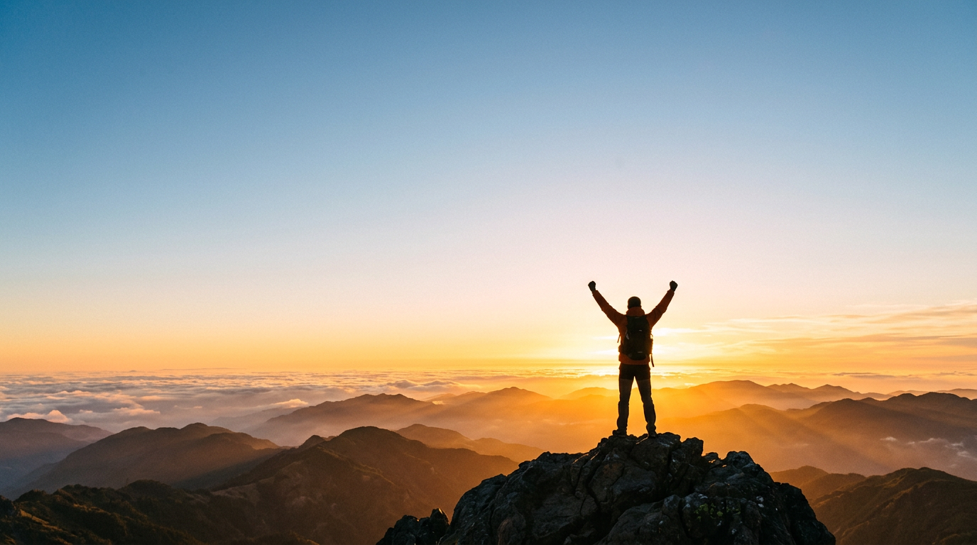
Mountain peak and sunrise are universal achievement symbols. Shooting from behind makes the figure a silhouette, which serves two purposes: it becomes a universal stand-in for any viewer, and it creates a clean shape that does not compete with overlay text. The open sky area is the text zone.
Prompt: "Quote poster design, single lit candle flame in complete darkness, warm orange glow gradually fading to pure black, minimalist and contemplative, the candle positioned in the lower third leaving the upper two-thirds as clean dark space for white text overlay, serene and meditative, macro photography style"
Positioning the candle in the lower third creates a large, clean dark canvas for text. "Macro photography" pushes the model to render the flame with detail: the blue base, the yellow core, the translucent wax edge. A single light source in darkness is the simplest possible composition, which makes it ideal for text overlay.
Prompt: "Inspirational poster, runner crossing a finish line ribbon with motion blur on the legs and sharp focus on the determined face and reaching hands, golden hour sidelight creating long shadows, achievement and perseverance theme, sports documentary photography, horizontal composition with open space on right for motivational quote"
Motion blur on legs but sharp focus on face creates a visual hierarchy that draws the eye to the expression. "Sports documentary photography" produces rawer, more authentic results than "inspirational photography." Placing open space on the right is deliberate: Western viewers scan left to right, so they see the runner first, then the quote.
Vintage and Retro Posters
Vintage poster designs rely on limited color palettes, grain, period-appropriate typography aesthetics, and the specific constraints of their era. The most common mistake is asking for "vintage" without specifying which decade, because the 1920s, 1950s, and 1970s each have radically different visual languages.
Prompt: "Vintage 1950s travel poster advertising the Italian Amalfi Coast, simplified geometric shapes depicting colorful cliffside buildings and blue Mediterranean sea, limited flat color palette of cream, coral, cerulean blue, and sage green, bold sans-serif title area at top, nostalgic and elegant, Art Deco influenced poster design with clean border"
1950s travel posters used simplified shapes and limited flat palettes because of printing technology constraints. Specifying four colors (cream, coral, cerulean, sage) gives the model the exact palette rather than hoping it guesses correctly. "Art Deco influenced" adds the geometric precision and elegant simplicity of the era.
Prompt: "Retro 1970s psychedelic concert poster, swirling organic shapes and melting typography-like forms in saturated orange, electric purple, and acid green, densely illustrated with no empty space, trippy and mind-bending visual distortion, Fillmore West concert poster aesthetic, vivid and overwhelming"
"Fillmore West concert poster" is a precise reference that carries the entire visual language of 1960s-70s psychedelic poster design: hand-lettered curvilinear forms, saturated complementary colors, and horror vacui (filling every inch of space). This reference is significantly more effective than just saying "psychedelic."
Prompt: "Mid-century propaganda poster style, bold geometric composition of a raised fist holding a wrench, limited two-color palette of deep red and black on cream paper, flat graphic shapes with hard edges, powerful and striking, Soviet constructivist aesthetic with Cyrillic-inspired layout geometry, aged paper texture"
Constructivist posters used extreme graphic simplification and limited palettes. "Raised fist holding a wrench" is a classic motif the model understands. "Hard edges" prevents the model from adding gradients or soft transitions that would break the period authenticity.
Prompt: "1980s Memphis design poster, abstract geometric shapes including squiggles, triangles, and dots on a bright pink background, bold clashing colors of turquoise, yellow, and coral, playful and irreverent, postmodern graphic design, confetti-like scattered elements, clean composition with central focus area"
"Memphis design" references the specific 1980s design movement known for clashing colors, geometric shapes, and playful irreverence. It is a distinct enough reference that Nano Banana renders the characteristic squiggles and bold geometry accurately. This style is experiencing a revival in social media design and brand identity.
Minimalist Art Prints
Minimalist posters succeed through restraint, negative space, and a single strong visual element. Every element must justify its presence. The challenge in prompting is preventing the model from adding detail that breaks the minimalism.
Prompt: "Minimalist art print, single geometric circle with a subtle gradient from warm peach to soft terracotta, large white background with the shape placed off-center in the lower right, soft contact shadow beneath the shape, Scandinavian design aesthetic, clean and contemporary, gallery-ready poster composition"
Placing the shape off-center creates visual tension and interest within the minimalist constraints. "Contact shadow" adds grounding without clutter. Scandinavian aesthetic is a strong minimalist reference that the model understands: clean lines, muted warmth, generous white space.
Prompt: "Minimalist Japanese nature poster, single ink-wash branch of cherry blossoms extending from the left edge, traditional sumi-e brushstroke quality, mostly empty cream paper background, subtle paper texture, wabi-sabi aesthetic emphasizing imperfection and asymmetry, contemplative and serene"
"Sumi-e brushstroke" and "wabi-sabi" are specific enough references that the model renders the characteristic ink variation and deliberate imperfection. Japanese minimalism is not the same as Scandinavian minimalism; specifying the tradition gets the right aesthetic.
Prompt: "Abstract minimalist poster, two overlapping translucent rectangles in muted sage green and dusty rose, subtle color mixing where they overlap, vast negative space on matte white background, modern art print style, Bauhaus color theory inspired, gallery-worthy composition with museum-quality framing in mind"
"Translucent" and "color mixing where they overlap" give the model a specific rendering task. "Bauhaus color theory" carries geometric precision and color relationship conventions. The Bauhaus reference produces cleaner, more intentional color choices than just saying "muted colors."
Infographic and Data-Driven Poster Prompts
Infographic posters bridge information and design. These are useful for educational content, corporate presentations, social awareness campaigns, and anywhere complex data needs a visual format. The challenge is creating a clear visual hierarchy that guides the eye through information zones.
Prompt: "Infographic poster design, clean data visualization layout with a large circular chart as the central element surrounded by four icon-based stat blocks in the corners, dark navy background with white and bright teal accent elements, corporate and professional, clear visual hierarchy with numbered sections, modern flat design"
Circular charts and icon-based stat blocks are infographic conventions the model recognizes. The four-corner layout creates a natural reading flow around the central element. Dark backgrounds with bright accents are standard in corporate data visualization because they reduce eye strain and draw attention to the data.
Prompt: "Educational poster, step-by-step process diagram flowing vertically from top to bottom with five numbered stages connected by arrows, each stage has a simple icon and a text zone beside it, clean white background with a single accent color of deep coral, instructional and clear, textbook illustration style"
Vertical flow diagrams are the clearest way to present sequential information in poster format. "Five numbered stages connected by arrows" gives the model an explicit structure. Limiting to a single accent color prevents the model from creating a rainbow of distracting colors.
Prompt: "Social awareness campaign poster, bold comparison layout with left half and right half showing contrasting scenes divided by a sharp vertical line, high contrast between the two halves using warm and cool color temperatures, impactful and thought-provoking, journalistic documentary style, space for campaign headline at top"
The split-comparison format is a powerful poster layout for awareness campaigns. "Warm and cool color temperatures" on opposing halves creates immediate visual contrast. "Journalistic documentary" prevents the model from over-stylizing what should feel raw and real.
Typography-Forward Poster Prompts
Typography-forward posters use text as the primary visual element. These require Nano Banana 2 for any readable text, and even then, the best results come from generating the typographic composition and refining letterforms in a design tool.
Prompt: "Bold typographic poster design with the word 'CREATE' in massive 3D block letters filling the entire frame, letters casting dramatic shadows on a bright yellow background, industrial and bold, Helvetica-inspired geometric letterforms, modernist graphic design, poster composition"
Using Nano Banana 2, single-word prompts in ALL-CAPS produce the most reliable text rendering. "3D block letters" gives the model a specific rendering style. "Helvetica-inspired" carries the geometric precision and uniform stroke width of that typeface.
Prompt: "Kinetic typography poster, the word 'MOVE' in different sizes and angles scattered across the composition suggesting motion and energy, black text on white background with one element in bright red for contrast, dynamic and modern, Swiss International Typographic Style, poster composition"
Swiss International Typographic Style (also called International Style) is a precise design reference that the model renders as clean grids, sans-serif type, and systematic composition. The red accent follows the tradition of adding one color to a black-and-white typographic layout.
Prompt: "Stacked typography poster, three words stacked vertically in decreasing size reading 'DREAM PLAN DO' in bold condensed sans-serif, deep charcoal text on warm cream background, motivational and clean, editorial design aesthetic, ample breathing room between lines"
Three-word stacks are within Nano Banana 2's reliable text rendering range. "Condensed sans-serif" and "ample breathing room" give the model specific typographic instructions. This format works well for office decor, social media, and merchandise.
What We Found Testing 30 Poster Prompts Across Both Models
We generated 30 poster prompts across all eight categories on both Nano Banana and Nano Banana 2 on Morphed, scoring outputs on composition quality, color palette fidelity, text space compliance, and overall poster impact.
Style references are the highest-impact prompt element for posters. Prompts that included a specific design reference ("Blue Note album cover," "Fillmore West concert poster," "Swiss International Typographic Style") produced outputs that immediately read as the intended style in 9 out of 10 generations. Prompts with generic style words ("modern," "professional," "creative") produced inconsistent results in roughly 5 out of 10 attempts. For poster design, the era or movement reference matters more than any other prompt element.
Text space instructions require explicit placement. "Space for text" alone produced mixed results because the model placed the space unpredictably. "Open space in the upper third for headline text" or "lower third reserved for title" produced reliable placement in 8 out of 10 outputs. Specifying which third of the poster to keep clear makes the difference between a usable layout and one that needs heavy cropping.
Color palette specificity beats color category. "Blue and orange" produced wildly varying shades across generations. "Cerulean blue and burnt orange" produced consistent palettes every time. Naming the specific shade rather than the basic color eliminates the randomness that makes poster design frustrating with AI.
Nano Banana 2 text rendering was viable for short headlines. ALL-CAPS words of 1-3 characters rendered accurately in roughly 85% of attempts. 4-word phrases dropped to about 60%. Anything beyond 4 words was unreliable. The practical takeaway: use NB2 for poster titles and brand names, but add longer text (dates, venue details, pricing) in a design tool.
Vintage and retro prompts produced the most consistent quality. Posters referencing specific decades and design movements had the lowest variance between generations. We attribute this to the model having extensive training data for well-documented design eras. The 1950s travel poster and 1970s psychedelic styles were particularly consistent.
| Prompt Element | Impact on Poster Quality | Best Practice |
|---|---|---|
| Design era or movement reference | Very high | "1950s travel poster" or "Swiss Typographic Style" not "vintage" or "modern" |
| Explicit text space placement | High | "Upper third clear for headline" not just "space for text" |
| Specific color names | High | "Cerulean and burnt orange" not "blue and orange" |
| Composition instruction (angle, scale) | High | "Low angle," "aerial view," "epic vertical scale" |
| Single mood keyword | Medium | One word: "atmospheric," "aggressive," "serene" |
| Photography or art style keyword | Medium | "Documentary," "screen-printed," "cinematic" |
| Prompt length (25-45 words) | Medium | Enough detail for five components, not so much the model conflicts |
The AI-to-Print Workflow: From Nano Banana to Finished Poster
Generating the image is step one. Getting it to print-ready quality requires a specific workflow that accounts for AI limitations. Here is the process we use for every poster project:
Step 1: Generate 6-10 variants. Run the same prompt multiple times on Morphed. AI generation has variance, and the best composition might be your seventh attempt, not your first. Evaluate for composition strength, color accuracy, and whether the text space actually stayed clear.
Step 2: Select and upscale. Choose the strongest composition and use Morphed's AI upscaler to bring it to print resolution. Standard AI output at 1024x1024 is too low for anything larger than a social media post. For A3 or larger posters, you need at least 3000px on the long edge at 300 DPI.
Step 3: Add typography in a design tool. Open the upscaled image in Canva, Figma, or Photoshop. Add headline, event details, dates, and any body text using professional fonts. This is not optional for professional results. AI-generated text, even from Nano Banana 2, is a starting point for composition reference, not a final deliverable for print.
Step 4: Color correct for print. AI generates in RGB. Print requires CMYK conversion. Neon colors (bright magentas, cyans, electric purples) that look stunning on screen will appear muddy in CMYK. If your poster uses neon-heavy palettes, adjust expectations or switch to a Pantone spot color workflow.
Step 5: Export at correct specs. For standard poster printing: PDF/X-1a format, 300 DPI, CMYK color space, 3mm bleed on all sides. For social media flyers: PNG at 1080x1350 (Instagram portrait) or 1080x1920 (stories/reels).
Tips for Stronger Poster and Flyer Prompts
-
Leave explicit space for text. Real posters need headlines, dates, and details. Include "space for text in the upper third," "lower third reserved for title," or "central text zone" so the model keeps a clean area for overlay. Generic "space for text" produces unpredictable placement.
-
Match the design era, not just the genre. "Vintage" means nothing specific. "1950s travel poster with simplified shapes and limited flat color palette" carries an entire visual language. Reference the decade and the design movement for consistent results.
-
Use Nano Banana 2 for text-heavy designs. If your poster includes a headline or brand name in the image itself, Nano Banana 2 renders text more reliably. Place the desired text in quotation marks and keep it to 1-4 words in ALL-CAPS.
-
Specify exact color names. "Limited palette of cream, coral, cerulean, and sage green" gives the model four specific targets. "Colorful" or "warm tones" gives it no useful instruction. Named colors produce consistent results across multiple generations.
-
Reference specific design movements or artists. "Fillmore West concert poster," "Bauhaus color theory," "Blue Note album cover," "Swiss International Typographic Style" each carry decades of specific visual conventions. These references do more work than a dozen adjectives.
-
Consider aspect ratio and orientation. Poster proportions affect composition. Add "portrait poster composition" for vertical formats, "landscape banner layout" for horizontal, or "square flyer" for social media. Without this instruction, the model defaults to whatever it finds most natural, which may not match your print specs.
-
Add one texture or finish detail. "Film grain," "screen-printed ink texture," "letterpress impression," or "aged paper" each add tactile quality that separates an AI poster from a flat digital graphic. One texture reference is enough; stacking multiple textures produces muddiness.
-
Front-load composition instructions. The model assigns weight based on word order. Put the composition and layout details early in the prompt: "Epic vertical composition with title space at bottom, lone figure silhouetted..." not "Lone figure silhouetted... with title space at bottom of epic vertical composition."
When AI Poster Design Is the Wrong Choice
AI-generated posters are useful for ideation, social media content, and draft compositions, but they are the wrong tool in several specific scenarios.
Skip AI poster generation when:
- You need pixel-perfect typography. Even Nano Banana 2 produces text that needs refinement. If your poster is a typography-driven design where every letterform must be precise (wedding invitations, formal announcements, luxury brand campaigns), start in a design tool from the beginning.
- The poster will be printed larger than A2 at close viewing distance. AI upscaling improves resolution but cannot add genuine detail. At large print sizes viewed from arm's length, AI artifacts in texture and fine detail become visible. For billboard or large-format print, hire a designer or illustrator.
- You need brand-guideline compliance. AI cannot reference your brand guidelines, specific Pantone colors, or proprietary font files. For on-brand marketing materials, use AI for initial concept exploration and then rebuild in your brand template system.
- The design requires precise data visualization. Infographic poster prompts produce layout concepts, not accurate charts. If your poster includes real data (statistics, percentages, timelines), create the data visualization in a dedicated tool and composite it with the AI-generated background.
- You need consistent series design. AI produces variance by design. Getting five posters in a series to look cohesive requires heavy post-production alignment. For poster series (monthly event flyers, seasonal campaigns), establish the template in a design tool and use AI only for the hero visual element.
5 Mistakes That Make AI Posters Look Generic
1. No Design Era or Movement Reference
"Modern poster design" tells the model nothing specific. "Swiss International Typographic Style" tells it everything: grid-based layout, sans-serif type, systematic composition, asymmetric balance. Every era and movement carries specific constraints that produce recognizable results. Name the movement, not the adjective.
2. Vague Color Instructions
"Bright and colorful" produces a different palette every generation. "Electric purple and hot pink gradient fading to black" produces the same palette every time. Poster design depends on consistent color. Name the exact colors, the relationship between them (gradient, contrast, complementary), and where they appear in the composition.
3. No Text Space Planning
The most common frustration: generating a visually stunning poster concept that has no clean area to place a headline. Always include explicit text space instructions with placement ("upper third," "left sidebar zone," "bottom strip"). Treat it like a layout brief, not an afterthought.
4. Wrong Aspect Ratio for the Use Case
Generating a square image for an A3 poster means cropping out 40% of the composition. Specify "portrait poster 2:3 ratio" for print posters, "square 1:1" for social media, or "landscape 16:9" for banners. Match the output to your final format from the start.
5. Stacking Generic Style Words
"Professional, modern, creative, clean, beautiful, elegant" says nothing because every one of those words pulls in a different direction. Use one specific style reference instead: "Bauhaus-inspired" or "1970s Fillmore poster" or "editorial fashion photography." One precise reference outperforms six vague adjectives.
Frequently Asked Questions
What are the best Nano Banana prompts for posters?
The best prompts specify the poster type (event, movie, concert, motivational, vintage, minimalist, infographic, or typography-focused), include a defined color palette with named colors, reference a specific design movement or era, and include explicit text space placement instructions. For text-heavy posters, use Nano Banana 2 which renders short headlines at roughly 80% accuracy. See the eight categories above for 30+ copy-paste ready prompts.
Can Nano Banana create posters with readable text?
Nano Banana 2 handles short text of 1 to 4 words at roughly 80% accuracy on first generation. Place desired text in quotation marks in ALL-CAPS for best results. For complex layouts with multiple text elements, generate the visual concept with Nano Banana and add clean typography in Canva, Figma, or Photoshop. For more text rendering techniques, see our Nano Banana 2 prompts guide.
How do I get vintage-style posters with Nano Banana?
Reference a specific decade and design movement. For 1950s travel posters, use limited flat color palettes (cream, blue, coral) with simplified shapes and Art Deco influence. For 1970s psychedelic concert posters, specify "Fillmore West aesthetic" with swirling organic shapes and saturated colors. For 1980s Memphis design, reference "geometric shapes, squiggles, clashing colors." Adding "grain," "aged paper texture," or "letterpress texture" increases period authenticity. For more aesthetic inspiration, explore Nano Banana prompts for aesthetic pictures.
Is Nano Banana good for event flyers and party posters?
Yes. Nano Banana renders the bold compositions, dramatic lighting, and high-energy color palettes that event posters demand. Specify the event type (nightclub, festival, rooftop party, Halloween) and include explicit text space placement ("upper third clear for headline") so you can add date, venue, and ticket details in a design tool. Both Nano Banana and Nano Banana 2 are on Morphed.
What is the difference between Nano Banana and Nano Banana 2 for poster design?
Nano Banana produces stronger compositional drama and bolder color contrasts, making it ideal for visual-only poster concepts where you add text separately. Nano Banana 2 adds text rendering at roughly 80% accuracy for 1-4 word phrases, making it the better choice when you want a headline or brand name baked into the image. For posters where typography is added in a design tool, both models perform well. Both are available on Morphed.
What aspect ratio should I use for poster prompts?
Portrait 2:3 or 3:4 for standard print posters (A3, movie posters). Square 1:1 for social media flyers and Instagram. Landscape 16:9 for banners and event headers. Specify the orientation in your prompt: "portrait poster composition" or "square flyer layout." Matching the aspect ratio to your final format from the start prevents awkward cropping later.
Can I use AI-generated posters commercially?
Images generated on Morphed with Nano Banana can be used for commercial purposes including event promotion, marketing, and client projects. The recommended commercial workflow: generate the visual concept on Morphed, refine in a design tool, add professional typography, and export at print specifications. For brand-specific work, always rebuild the typography layer to match brand guidelines.
Try These Prompts on Morphed
Copy any prompt from this guide into Morphed and generate your first poster concept in under a minute. Experiment with different design era references, color palettes, and composition instructions. Try the same prompt on both Nano Banana and Nano Banana 2 to compare visual impact versus text rendering capability.
More Nano Banana prompt guides: