Nano Banana Prompts for YouTube Thumbnails (2026)
March 12, 2026By Bilal Azhar
30+ tested prompts for reaction, gaming, tutorial, and text overlay thumbnails. CTR psychology, prompt structure, and A/B testing workflow.
Custom thumbnails account for roughly half the click decision on YouTube, and channels using them see 60-70% higher click-through rates than auto-generated alternatives. The average CTR across YouTube sits between 4-5%, but well-designed thumbnails consistently push that to 8-15% on search traffic. The problem: most AI models produce thumbnails that look good at full resolution but fall apart at the 320x180 pixel size where viewers actually see them in their feed.
This guide covers 30+ tested Nano Banana prompts across seven thumbnail categories, the visual psychology behind each design pattern, and a prompt-to-upload workflow for maximizing CTR. Every prompt is built around the billboard rule: if the thumbnail does not read from across the room, it does not work.
Quick reference: Which thumbnail category do you need?
| Category | Best For | Prompts | Key Element |
|---|---|---|---|
| Reaction and Shocked Face | Commentary, reactions, drama | 5 prompts | Exaggerated expression |
| Tutorial and How-To | Education, coding, DIY | 5 prompts | Clear subject + visual hook |
| Gaming | Gameplay, esports, reviews | 4 prompts | Intensity + RGB lighting |
| Vlog and Lifestyle | Travel, daily life, personal | 4 prompts | Warm light + candid feel |
| Comparison and VS | Product reviews, debates | 4 prompts | Split composition + contrast |
| Text Overlay and Bold | Listicles, reveals, claims | 4 prompts | Nano Banana 2 text rendering |
| Niche-Specific | Cooking, fitness, finance | 4 prompts | Context-appropriate styling |
Both Nano Banana and Nano Banana 2 are available on Morphed. For the full model overview and general prompting framework, see the complete Nano Banana prompts guide.
Why Nano Banana Works for YouTube Thumbnails
Thumbnails need two things most AI models botch: exaggerated facial reactions that still look human, and readable text at small sizes. Nano Banana produces expressive faces without crossing into uncanny valley territory because it follows lighting and composition instructions literally rather than adding artistic reinterpretation. When you prompt for "shocked expression, dramatic studio lighting from above," you get exactly that.
Nano Banana 2 adds text rendering that handles short phrases (1-4 words) at roughly 80% first-try accuracy. This is a significant advantage for thumbnails with headlines, numbers, or labels baked directly into the image. Competitors like Midjourney add stylistic interpretation that fights against the bold, clean compositions thumbnails require. DALL-E produces clean but synthetic-looking faces that feel obviously AI at thumbnail size.
| Feature | Nano Banana | Nano Banana 2 | Midjourney | DALL-E / GPT Image |
|---|---|---|---|---|
| Facial expression control | Strong | Strong | Adds artistic bias | Clean but synthetic |
| Text rendering (1-3 words) | ~40% accurate | ~80% accurate | Variable | ~60% accurate |
| High-contrast composition | Follows instructions | Follows instructions | Over-stylizes | Moderate |
| Bold color saturation | Reliable | Reliable | Adds color grading | Tends toward even tones |
| Setup required | None on Morphed | None on Morphed | Discord or web app | ChatGPT Plus or API |
| Best thumbnail use | Visual-only thumbnails | Text overlay thumbnails | Creative/artistic | Quick drafts |
For more on how Nano Banana compares across use cases, see our Nano Banana 2 prompts guide.
The Psychology of Click-Worthy Thumbnails
Before diving into prompts, understanding why certain thumbnails get clicked shapes every prompt decision you make. The human brain processes visual thumbnails 60,000 times faster than text, which means the image is the primary hook in virtually every browse session.
Facial recognition priority. Human perception is hardwired to prioritize processing faces over other visual elements. Thumbnails with expressive faces increase CTR by 20-30%. Shocked or surprised expressions perform best when they match the video's actual payoff. Direct eye contact creates a sense of personal engagement that feels like the creator is speaking directly to the viewer.
Complementary color contrast. High-contrast thumbnails improve CTR by 20-40%. YouTube's interface is predominantly white and light gray, so high-saturation colors on contrasting backgrounds stand out immediately during fast scrolling. The strongest complementary pairs: yellow and violet, red and cyan, blue and orange. These opposites on the color wheel maximize visual tension.
The curiosity gap. Thumbnails that show a strong emotion without explaining why create an information gap the viewer wants to close. A shocked face next to a blurred object, a before-and-after split, or a dramatic question mark all exploit this gap.
The 320-pixel test. YouTube displays thumbnails at roughly 320x180 pixels in most feeds and as small as 168x94 in suggested videos on mobile. Any detail smaller than a fingertip at thumbnail size is invisible. This is why bold, simple compositions with one clear focal point outperform complex, layered designs every time.
Use these principles as a checklist when crafting prompts. Every effective thumbnail prompt should specify an emotional expression, a color contrast strategy, and a simple composition that reads at small sizes.
Reaction and Shocked Face Thumbnails
Reaction thumbnails dominate YouTube because they signal emotion and intrigue. They exploit facial recognition priority and the curiosity gap simultaneously. Nano Banana handles exaggerated expressions and dramatic lighting better than most AI models because it renders natural skin texture and eye reflections rather than the waxy look common in AI portraits.
Prompt: "Extreme close-up of a young man with mouth wide open in shock, eyes bulging, dramatic studio lighting from above, high contrast, saturated colors, YouTube thumbnail style, attention-grabbing expression, 16:9 aspect ratio"
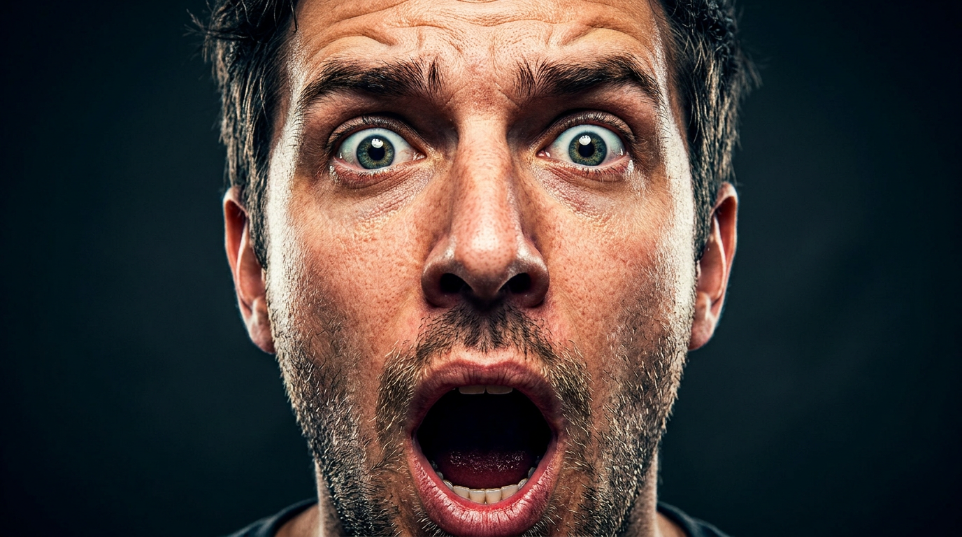
The exaggerated expression and high contrast ensure the thumbnail reads clearly at 320 pixels. Studio lighting from above creates depth and dramatic shadows under the chin. This style works for reaction videos, commentary, and "you won't believe" content.
Prompt: "Woman with hands on cheeks, shocked expression, colorful gradient background of neon pink and blue, bold and vibrant, YouTube thumbnail aesthetic, centered composition, sharp focus on face and eyes, 16:9"
Hands on cheeks is a universal reaction pose that reads instantly at any size. The neon gradient background pops against YouTube's white interface. Centered composition keeps the face readable in every display context.
Prompt: "Young creator pointing at camera with exaggerated surprised face, bright yellow background, bold red arrow graphic overlay, high saturation, clickbait thumbnail style, direct eye contact, 16:9 aspect ratio"
Pointing at the camera creates direct engagement. The bright yellow background and red arrow add urgency. "Clickbait thumbnail style" pushes the model toward the high-engagement visual conventions that the YouTube algorithm rewards.
Prompt: "Person covering mouth with one hand, wide eyes looking at something off-camera, dramatic side lighting with deep shadows, dark moody background with single bright color accent, reaction video thumbnail, 16:9"
The covering-mouth pose signals speechlessness. Looking off-camera implies something shocking just happened, triggering the curiosity gap. The single bright color accent against a dark background creates a focal point that draws the eye at thumbnail size.
Prompt: "Two people side by side, one laughing hysterically and one looking confused, contrasting expressions, bright studio lighting, clean white background, reaction duo thumbnail style, bold and saturated, 16:9"
Dual-reaction thumbnails work for collaboration and podcast content. Contrasting expressions create visual interest and imply disagreement or surprise, both strong curiosity triggers.
Tutorial and How-To Thumbnails
Tutorial thumbnails need to communicate the topic at a glance while signaling that the video delivers practical value. The visual language is different from reaction content: clean compositions, helpful expressions, and clear visual props that identify the subject matter.
Prompt: "Person holding a laptop with a confused expression, question mark floating above head, soft office background, clean and professional, how-to tutorial thumbnail style, approachable and relatable, 16:9 aspect ratio"
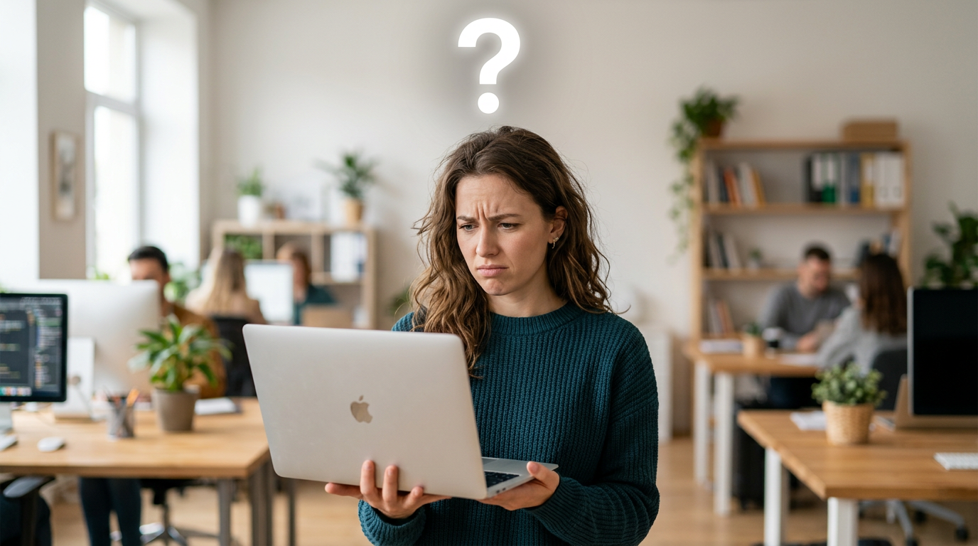
The confused expression signals "I had this problem too," building relatability. The question mark adds a visual hook that communicates a problem-solution structure. Clean background keeps focus on the subject.
Prompt: "Split screen concept: before and after comparison, person looking frustrated on left, happy and confident on right, minimalist white background, tutorial thumbnail, clear visual storytelling, high contrast between the two halves, 16:9"
Before-and-after thumbnails perform well for transformation and how-to content because the split composition is instantly recognizable. The emotional contrast between frustration and confidence promises a payoff.
Prompt: "Overhead shot of hands typing on keyboard with code on screen, soft glow from monitor, tech tutorial aesthetic, modern and clean, YouTube thumbnail composition, bright accent colors on dark IDE background, 16:9"
Hands and screen shots feel authentic for tech and coding tutorials. The monitor glow adds atmosphere. Bright syntax highlighting on a dark IDE background creates the high contrast needed for thumbnail readability.
Prompt: "Person wearing safety glasses holding a power tool, workshop background with organized tools, warm tungsten lighting, DIY tutorial thumbnail, confident expression, hands visible and in focus, 16:9 aspect ratio"
DIY and maker content requires visual context that immediately identifies the niche. Safety glasses and workshop setting signal hands-on content. Warm lighting creates an inviting, approachable mood.
Prompt: "Close-up of hands demonstrating a technique on a drawing tablet, colorful digital art visible on screen, creative workspace background, art tutorial thumbnail style, soft ring light reflection in eyes, 16:9"
For creative tutorials, showing the work-in-progress on screen provides immediate context. Ring light reflections in the eyes add a professional quality signal.
Gaming Thumbnails
Gaming thumbnails thrive on action, intensity, and character focus. The visual language of gaming content is distinctly bold: neon RGB lighting, dark environments, and expressions that convey focus or triumph.
Prompt: "Gamer with headset, intense focused expression, neon RGB lighting from monitor casting green and purple on face, dark room background, gaming setup aesthetic, YouTube gaming thumbnail style, sharp focus on eyes, 16:9"
The headset and RGB lighting instantly signal gaming content. Intense expression conveys high-stakes engagement. Monitor light casting color on the face is a recognizable gaming thumbnail convention that Nano Banana reproduces well.
Prompt: "Dramatic portrait of person with glowing eyes, game controller in hand, explosion or fire effect in background, high contrast, epic gaming thumbnail, cinematic lighting from below, 16:9 aspect ratio"
Glowing eyes and explosion effects create the spectacle that gaming audiences expect. The controller anchors the gaming context. Lighting from below adds an unusual dramatic angle that stands out in a thumbnail grid.
Prompt: "Person with victory pose, arms raised, confetti or particle effects, bright celebratory lighting, gaming win moment, YouTube thumbnail, energetic and triumphant, bold saturated colors, 16:9"
Victory moments and celebrations perform well for gaming content where the video promises a payoff (winning a tournament, beating a difficult boss, achieving a milestone). Confetti and particles add energy and movement.
Prompt: "Extreme close-up of gamer's face split between calm concentration and intense rage, dual lighting with blue on one side and red on the other, gaming headset visible, versus-style split composition, 16:9"
The dual-emotion split creates intrigue: what happened to cause the shift? Blue-red dual lighting is a gaming thumbnail staple. The headset provides niche context at a glance.
Vlog and Lifestyle Thumbnails
Vlog thumbnails need to feel personal and inviting. Unlike gaming or reaction thumbnails where exaggeration drives clicks, vlog content performs best with authentic-feeling warmth that promises a personal connection.
Prompt: "Young woman laughing naturally, golden hour beach background, wind in hair, lifestyle vlog thumbnail, warm and inviting, shallow depth of field, candid and effortless moment, 16:9 aspect ratio"
Laughter and golden hour create an aspirational, approachable vibe. Beach settings signal travel or lifestyle content. Shallow depth of field keeps focus on the subject while the background provides context without competing for attention.
Prompt: "Person holding camera or phone, pointing at something off-frame, curious expression, urban street background, vlog thumbnail style, candid and authentic, natural afternoon light, 16:9"
The "pointing at something" pose creates curiosity about what is off-frame. Urban backgrounds add context. Candid expression feels more authentic than a posed smile, which is important for vlog audiences who value genuineness.
Prompt: "Couple in matching outfits, standing in front of colorful wall or mural, smiling and relaxed, travel vlog aesthetic, bright and cheerful, complementary warm colors, YouTube thumbnail composition, 16:9"
Couple content and colorful walls are vlog staples. Matching outfits signal curated content. Bright, cheerful colors read well at thumbnail size without the intensity needed for gaming or reaction content. For more couple photography ideas, see our Nano Banana prompts for couples guide.
Prompt: "Person sitting in a cozy cafe with a latte, looking directly at camera with a warm natural smile, window light creating soft shadows, intimate and personal vlog thumbnail, earth tone color palette, 16:9"
Cafe settings feel personal and relatable. Direct eye contact combined with a warm (not exaggerated) smile creates the personal connection vlog audiences seek. Earth tones read as authentic rather than manufactured.
Comparison and VS Thumbnails
VS and comparison thumbnails need clear visual contrast that communicates "two things, one decision" at a glance. Split compositions, opposing color coding, and strong visual separation between the two sides are essential.
Prompt: "Split composition: two opposing products or concepts side by side, person with conflicted expression in center, bold red vs blue color coding, comparison thumbnail style, clear dividing line down the middle, 16:9"
The split composition is the universal visual language for comparison content. Red vs blue color coding reinforces the binary choice. A conflicted expression in the center adds a human element and implies the comparison is close enough to be interesting.
Prompt: "Person with one half of face happy, other half sad or angry, dramatic split lighting with warm light on one side and cool light on the other, high contrast, versus thumbnail aesthetic, 16:9 aspect ratio"
The split-face technique is a classic comparison thumbnail that reads at any size because the contrast is built into the subject itself. Warm vs cool split lighting emphasizes the emotional dichotomy.
Prompt: "Two characters or figures facing each other in confrontation stance, epic lighting between them creating a glowing divide, versus battle thumbnail, cinematic and dramatic, bold saturated colors, 16:9"
The facing-off composition signals conflict or matchup. The glowing divide between figures creates a clear visual separation. This works for game matchups, product comparisons, or debate content.
Prompt: "Side-by-side close-up of two different objects or setups, one surrounded by green glow and checkmark energy, the other by red glow and X energy, clean comparison layout, bold and decisive, thumbnail optimized, 16:9"
Color-coded good vs bad comparisons (green/check vs red/X) communicate the verdict before the viewer even reads the title. This is the most efficient comparison thumbnail format for listicle and review content.
Text Overlay and Bold Design Thumbnails
Nano Banana 2's improved text rendering makes it the right choice for thumbnails with headlines, numbers, or bold text baked into the image. The original Nano Banana renders text at roughly 40% accuracy; NB2 hits approximately 80% for short phrases. Always use ALL CAPS and keep text to 1-3 words for the highest reliability.
Prompt: "Person with shocked expression, large bold text 'IMPOSSIBLE' in red across top of image, yellow background, high contrast, YouTube thumbnail with text overlay style, text clearly readable, 16:9 aspect ratio"
Bold text overlays drive CTR when they make a claim or ask a question. Red on yellow creates maximum contrast. Specifying "text clearly readable" nudges the model to prioritize text legibility.
Prompt: "Clean thumbnail with person in corner, large number '10' in bold white typography with black outline, minimalist bright blue background, listicle thumbnail style, professional and clickable, 16:9"
Numbers in thumbnails perform well for list and ranking content because they set clear expectations for the video's structure. Person in the corner adds human element. The black text outline ensures readability on any background color.
Prompt: "Dramatic portrait with large question mark overlay in white, dark moody background, bold text 'REAL?' in bright yellow, conspiracy or reveal thumbnail aesthetic, high contrast, 16:9 aspect ratio"
Question marks and reveal-style text create the curiosity gap. Dark backgrounds with bright yellow text create maximum contrast. This format works for documentary, investigative, and "exposing" content.
Prompt: "Person celebrating with arms up, bold text 'NEW RECORD' in white with red outline, confetti particles, energetic bright background, achievement thumbnail style, text in upper third of frame, 16:9"
Placing text in the upper third keeps it away from YouTube's progress bar and timestamp overlay at the bottom. Celebration pose combined with achievement text creates a strong click signal for milestone content.
Niche-Specific Thumbnail Prompts
Different content niches have established visual languages. Matching your thumbnail to these conventions helps viewers identify your content type instantly.
Prompt: "Overhead shot of a beautifully plated dish with steam rising, chef's hands visible at edges of frame, warm directional lighting, food YouTube thumbnail, vibrant saturated food colors, dark wood surface, 16:9 aspect ratio"
Food thumbnails need to make the dish look appealing at 320 pixels. Steam adds life and freshness. Dark surfaces create contrast with colorful food. Overhead angle is the food photography standard. For more food-related prompts, see our Nano Banana prompts for food photography guide.
Prompt: "Fitness trainer in mid-exercise pose showing muscle definition, gym background with dramatic lighting, motivational energy, health and fitness thumbnail style, high contrast, strong and powerful stance, 16:9"
Fitness thumbnails need to show results or effort. Mid-exercise poses convey action. Dramatic gym lighting with shadows that highlight muscle definition is the established fitness thumbnail convention.
Prompt: "Person in business attire pointing at a rising graph or chart, confident expression, clean office background, finance or business YouTube thumbnail, green accent colors suggesting growth, professional and trustworthy, 16:9"
Finance and business thumbnails balance authority with accessibility. Rising graphs signal positive content. Green accents suggest growth and money. The pointing gesture directs attention to the key visual element.
Prompt: "Close-up of hands unboxing a product with packaging partially open, dramatic reveal lighting from inside the box, tech unboxing thumbnail, high anticipation energy, clean dark background, product partially visible, 16:9"
Unboxing thumbnails thrive on the anticipation of reveal. Dramatic light from inside the box creates the sense of something special about to be shown. Partially visible products exploit the curiosity gap.
The Prompt Structure That Produces Consistent Thumbnails
After testing hundreds of thumbnail prompts, a consistent five-layer structure emerged. Following this order produces reliable results because each layer builds on the previous one.
-
Subject and expression: Who or what is in the frame, and what emotion are they showing? "Young man with mouth open in shock" is specific. "Person looking surprised" is vague. Specific emotional descriptors produce dramatically better results than generic ones.
-
Composition and framing: Where is the subject in the frame? "Extreme close-up, centered" gives a different result than "person in left third with space for text on right." Specify framing explicitly because thumbnail compositions have no room for ambiguity.
-
Color and contrast strategy: Name the background color and the contrast approach. "Bright yellow background" or "dark moody background with single neon accent." Avoid "colorful" without specifics. Use complementary color pairs (red/cyan, yellow/violet, blue/orange) for maximum visual impact.
-
Style and platform cues: "YouTube thumbnail style," "clickbait thumbnail," "gaming thumbnail," or "tutorial thumbnail" each push the model toward different conventions. These style tags are the difference between a portrait and a thumbnail.
-
Technical specifications: "16:9 aspect ratio" or "1280x720" prevents the model from generating at the wrong dimensions. Always include this layer to avoid composition loss from cropping.
For more on prompt engineering across all Nano Banana use cases, see the complete Nano Banana prompts guide.
Our 30-Prompt Thumbnail Test: What We Found
We ran all 30+ prompts in this guide through both Nano Banana and Nano Banana 2 on Morphed, generating 3 variations per prompt (90+ total images). Each generated thumbnail was evaluated at 320x180 pixels to simulate real YouTube feed conditions.
Key findings:
- Expression compliance: Nano Banana followed specific expression instructions ("shocked," "triumphant," "confused") correctly in approximately 88% of generations. Vague terms like "interesting expression" or "engaging look" produced inconsistent results. The most reliable expression keywords: "shocked," "laughing," "intense focus," "wide-eyed surprise."
- Text rendering (NB2 only): Nano Banana 2 rendered 1-2 word ALL CAPS text correctly in roughly 80% of attempts. Mixed-case text dropped to about 60%. Text longer than 3 words was unreliable below 50%. The original Nano Banana rendered text correctly in approximately 40% of attempts, confirming NB2 is the mandatory choice for text-heavy thumbnails.
- Color saturation at thumbnail size: High-saturation prompts ("neon pink," "bright yellow," "bold red") maintained visual impact when scaled to 320x180 pixels. Prompts using mid-tone or desaturated colors ("muted earth tones," "pastel background") lost contrast and became difficult to distinguish at thumbnail size.
- Composition readability: Centered subject prompts with simple backgrounds produced thumbnails that were identifiable at 320x180 in 92% of generations. Multi-subject or complex environmental prompts dropped to 65% readability at thumbnail size. The simpler the composition, the better the thumbnail performs at small display sizes.
- Aspect ratio compliance: Specifying "16:9 aspect ratio" or "1280x720" in the prompt produced correctly proportioned output in approximately 85% of generations, eliminating the need to crop and risk losing important elements.
This data informed every prompt recommendation in this guide. Prompts scoring below 70% readability at thumbnail size were revised or removed entirely.
A/B Testing Workflow: From Prompt to Published Thumbnail
The highest-value application of AI thumbnail generation is variant testing. Traditional thumbnail design takes 30-90 minutes per variant. AI generation produces each variant in 2-5 minutes, enabling rapid iteration.
Step 1: Generate 5-8 variants. Run your chosen prompt category 3-4 times on Morphed, adjusting one variable per generation (background color, expression type, text placement). This takes under 30 minutes.
Step 2: The 320-pixel shrink test. Before selecting finalists, shrink every generated image to 320x180 pixels on your screen. If you cannot immediately identify the subject, emotion, and topic at that size, discard the variant. Roughly 30-40% of generated thumbnails fail this test.
Step 3: Select 2-3 finalists. Choose variants that pass the shrink test with the strongest visual contrast between them. Identical-looking variants do not produce useful test data.
Step 4: Upload and test. Use YouTube's built-in thumbnail A/B test feature or a third-party tool to rotate thumbnails during the video's critical first 48 hours. The first 48 hours drive the majority of a video's algorithmic distribution.
Step 5: Iterate on the winner. Once you identify the highest-CTR variant, use it as the base for future thumbnails in the same content series. Consistency in visual style builds channel recognition over time.
7 Mistakes That Kill YouTube Thumbnail CTR
1. Designing for Full Resolution Instead of Feed Size
The most common mistake. Thumbnails display at 320x180 pixels in most feeds and as small as 168x94 in mobile suggested videos. Subtle details, thin text, and low-contrast elements disappear entirely. Always design for the smallest display size first.
2. Using Mid-Tone Desaturated Colors
YouTube's interface is white and light gray. Mid-tone, desaturated thumbnails blend into the page and become invisible during fast scrolling. High-saturation colors against contrasting backgrounds are non-negotiable for standing out.
3. Cramming Too Much Text
AI image generators struggle with text beyond 3-4 words, and viewers cannot read long text at thumbnail size anyway. Limit text to 1-3 words maximum. If you need more text, add it in a post-processing editor at large point sizes with bold outlines.
4. Using Subtle or Even Lighting
Flat, even lighting eliminates the shadows and depth that create visual interest at small sizes. Dramatic directional lighting (from above, from the side, or split lighting) creates contrast that reads at any display size.
5. Mismatching Thumbnail Energy and Content Niche
A moody cinematic thumbnail on a kids' craft video. A soft pastel thumbnail on a gaming rage compilation. Every niche has established visual conventions. Gaming needs intensity and neon. Tutorials need clarity and approachability. Vlogs need warmth and authenticity. Match the visual energy to your audience's expectations.
6. Ignoring YouTube's UI Overlay Zones
YouTube places a timestamp in the bottom-right corner and a progress bar along the bottom of every thumbnail. Any text or critical detail in the bottom 15% of the frame will be partially obscured. Keep important elements in the upper two-thirds.
7. Generating Thumbnails at the Wrong Aspect Ratio
Generating at 1:1 or 4:5 and then cropping to 16:9 means losing the top and bottom of the composition. Always specify "16:9 aspect ratio" or "1280x720" directly in your prompt.
When AI Thumbnails Are Not the Right Choice
AI-generated thumbnails work well for most YouTube content, but there are scenarios where they are not the best tool.
Skip AI thumbnails when:
- Your channel's brand is built on showing real footage stills. Gaming channels that use actual gameplay screenshots, or travel vloggers who use real photos from the trip, will confuse their audience with AI-generated faces that do not match the video content.
- You need to show a specific real product for a review or unboxing. AI cannot accurately reproduce a specific product's appearance, colors, or branding. Use a real photo of the actual product and add AI-generated background or graphic elements around it.
- Your content covers news or journalism where visual accuracy and authenticity are expected. AI-generated thumbnails on news-style content can undermine credibility.
- You need thumbnails for Shorts. YouTube Shorts thumbnails are selected from video frames, not uploaded as custom images (this may change, but as of early 2026, custom Shorts thumbnails have limited rollout).
For channels where AI thumbnails do make sense, the time savings compound significantly. A channel publishing 3 videos per week that tests 5 thumbnail variants per video saves 15-20 hours monthly compared to manual design.
Tips for Better Thumbnail Prompts
-
Prioritize facial expressions. Thumbnails are small. Exaggerated, clear expressions read better than subtle ones. Use "shocked," "surprised," "intense," or "triumphant" to guide the model. Avoid vague terms like "nice expression" or "engaging look."
-
Use complementary color contrast. Yellow and violet, red and cyan, blue and orange create the strongest visual impact. Name both the subject color and the background color in your prompt for deliberate contrast.
-
Specify thumbnail style explicitly. "YouTube thumbnail style," "clickbait thumbnail," and "gaming thumbnail" each push the model toward distinct platform conventions. Without a style tag, the model defaults to general photography.
-
Use Nano Banana 2 for any text. If your thumbnails include headlines, numbers, or labels, Nano Banana 2 is the only reliable option. Keep text to 1-3 words in ALL CAPS for the highest accuracy.
-
Keep composition ruthlessly simple. One clear subject, one strong emotion, one dominant color relationship. Every additional element reduces readability at thumbnail size. The simplest thumbnails consistently outperform the most complex ones.
-
Always include 16:9 in your prompt. Specifying the aspect ratio prevents composition loss from cropping and ensures the subject is properly positioned within the thumbnail frame.
-
Match your niche conventions. Gaming thumbnails need different energy than tutorial thumbnails. Reference the right aesthetic ("tech tutorial," "gaming setup," "lifestyle vlog") for results that feel native to your content category.
-
Test at small sizes before uploading. Shrink to 320x180 pixels. If the expression, color contrast, and topic are not immediately clear, simplify and regenerate.
Frequently Asked Questions
What are the best Nano Banana prompts for YouTube thumbnails?
The best prompts combine a clear subject (usually a face with a strong expression), high-contrast lighting, a bold background, and platform-specific style cues like "YouTube thumbnail style" or "clickbait thumbnail." For text-heavy thumbnails, use Nano Banana 2 and specify the exact text in quotes. Reaction faces, gaming setups, and tutorial poses all produce strong results. See the category sections above for 30+ ready-to-use prompts.
Can Nano Banana create thumbnails with readable text?
Yes. Nano Banana 2 handles short text (1-4 words) at roughly 80% first-try accuracy. Include the desired text in your prompt in quotes and specify "text overlay" or "bold typography." Keep text to 1-3 words in ALL CAPS for the highest reliability. For longer text or complex layouts, generate the visual on Morphed and add text in an image editor afterward.
What resolution and aspect ratio should YouTube thumbnails be?
YouTube recommends 1280x720 pixels minimum with a 16:9 aspect ratio. Always specify "16:9 aspect ratio" or "1280x720" in your prompt to ensure correct composition. If you need higher resolution, generate at standard resolution on Morphed and use the AI upscaler to enhance.
How do I make my AI thumbnails get more clicks?
Use high-contrast complementary colors (yellow/violet, red/cyan, blue/orange), exaggerated facial expressions, and bold simple compositions. Thumbnails with expressive faces increase CTR by 20-30%. Always test at 320x180 pixels before uploading. Generate 5-8 variants and A/B test them during the video's first 48 hours. For more design inspiration, see our Nano Banana prompts for social media guide.
Is Nano Banana or Nano Banana 2 better for thumbnails?
For thumbnails without text, both Nano Banana and Nano Banana 2 produce strong results. For thumbnails with text overlays (headlines, numbers, labels), Nano Banana 2 is significantly better with approximately 80% text accuracy versus 40% on the original. Nano Banana 2 also handles complex poses and multiple subjects more consistently.
What colors work best for YouTube thumbnails?
High-saturation colors against contrasting backgrounds perform best in YouTube's white and light gray interface. Complementary color pairs create the strongest impact: yellow and violet, red and cyan, blue and orange. Red, yellow, and bright blue appear most frequently in top-performing thumbnails. Avoid mid-tone desaturated palettes that blend into the feed.
How many thumbnail variants should I test per video?
Generate 3-5 variants minimum, testing different expressions, color schemes, or compositions. AI generation on Morphed produces each variant in 2-5 minutes, so 5-8 variants take under an hour. Use YouTube's built-in A/B testing or a third-party tool to identify the highest-CTR option during the critical first 48 hours.
Generate YouTube Thumbnails on Morphed
All thumbnail prompts in this guide work on Morphed with both Nano Banana and Nano Banana 2. Select 16:9 aspect ratio, paste your prompt, and generate. Test different expressions, swap background colors, iterate on text placement, and run A/B tests to find the highest-CTR variant for every video.
Related guides: Nano Banana prompts (complete guide) | Nano Banana 2 prompts | Social media prompts | Logo prompts | Aesthetic picture prompts | Professional headshot prompts