Nano Banana Prompts for Logos (2026)
March 12, 2026By Bilal Azhar
30+ tested logo prompts across 8 categories. Text rendering technique, model comparison data, and the mistakes that make AI logos look like clip art.
Most AI logo prompts produce the same result: a glossy, over-detailed emblem floating on a gradient background that looks like a 2008 stock icon pack. The logo has too many colors, too many effects, and no chance of working at 32 pixels on a browser tab. After testing 30+ prompt variations across Nano Banana, Nano Banana 2, and Nano Banana Pro on Morphed, one technique consistently fixed this: silhouette-first prompting. Describe the shape and composition before adding color or texture.
"Cool modern logo for a tech company" produces clip art. "Simple geometric mark combining two overlapping triangles, black on white, flat vector design, no gradients" produces a logo that actually functions as a logo. That distinction is the difference between an AI novelty and a usable design starting point.
Quick reference: which logo style do you need?
| Category | Best For | Key Prompt Elements | Prompts |
|---|---|---|---|
| Minimalist and Modern | Tech, SaaS, apps, clean branding | Geometric shapes, flat design, 2-color, white background | 4 prompts |
| Vintage and Retro | Restaurants, barbershops, craft brands | Ornate serif, aged textures, warm tones, badge format | 4 prompts |
| Wordmark and Lettering | Name-driven brands, fashion, media | NB2 required, ALL-CAPS, specific font style, short text | 4 prompts |
| Monogram and Lettermark | Luxury, law firms, personal brands | 1-2 letters, intertwined or geometric, gold or black | 4 prompts |
| Icon and Symbol | Apps, social avatars, favicons | No text, simple silhouette, rounded square, flat color | 4 prompts |
| Brand Mockups | Pitches, social media, portfolio | Logo in context: packaging, storefront, business card | 4 prompts |
| Embossed and 3D | Premium print, foil stamping, luxury | Material texture, depth, metallic finish, dark background | 3 prompts |
| Badge and Emblem | Sports teams, outdoor brands, brewing | Circular frame, banner text, central icon, limited palette | 3 prompts |
Both Nano Banana and Nano Banana 2 are available on Morphed. For the full model overview and general prompting framework, see the complete Nano Banana prompts guide. For text-heavy scenes beyond logos, see our Nano Banana 2 prompts guide.
Why Nano Banana Produces Better Logos Than Midjourney or DALL-E
Logo design is uniquely punishing for AI because logos must work at extreme sizes: a 16-pixel favicon, a 200-pixel app icon, and a 2,000-pixel billboard. Most AI models optimize for visual impressiveness at screen resolution, adding gradients, shadows, and fine detail that disappears or becomes noise at small sizes. Nano Banana handles this better because it follows composition and constraint instructions literally rather than adding artistic embellishment.
We tested 30 logo prompts across Nano Banana, Nano Banana 2, Midjourney v6, and DALL-E 3, scoring each output on four criteria: compositional simplicity (could the logo work at 32 pixels), text accuracy (was the text rendered correctly), color discipline (did the model stick to the specified palette), and background isolation (was the background clean and uniform).
| Feature | Nano Banana | Midjourney v6 | DALL-E / GPT Image | Flux |
|---|---|---|---|---|
| Compositional simplicity | Follows "minimal" and "flat" instructions literally | Adds detail and texture even when not requested | Medium, sometimes adds gradients | Good with detailed constraints |
| Text rendering accuracy | Good on NB2 (~80% for 1-4 words) | Variable, often decorative rather than legible | Good for short text | Good |
| Color palette discipline | Sticks to named colors | Often adds accent colors or gradients not in prompt | Good | Good |
| Background isolation | Clean white/black when specified | Sometimes adds environmental elements | Good | Good |
| Scalability of output | Strong simple shapes | Over-detailed for small sizes | Medium | Good |
| Vector-style rendering | Strong with "flat design" instruction | Adds painterly or 3D effects | Medium | Good |
| Setup required | None on Morphed | Discord or web app | ChatGPT Plus or API | Local install or hosted |
The biggest gap appeared in compositional restraint. Midjourney consistently added visual complexity (textures, gradients, shadows, environmental elements) to logo prompts even when the prompt explicitly said "minimal" or "flat design." For logo work where simplicity is the goal, Nano Banana's literal prompt interpretation is an advantage, not a limitation.
Text Rendering: What Actually Works and What Does Not
Text accuracy is the make-or-break factor for any logo with a wordmark. Here is what Nano Banana 2 handles well and where it struggles, based on our testing across 30 text-inclusive logo prompts.
| Text Type | Reliability | Tips |
|---|---|---|
| 1-2 words (brand name) | High (~80% accurate) | Put exact text in quotes, use ALL-CAPS |
| 3-4 word phrases | Good (~65% accurate) | Keep words short and common |
| 5+ word taglines | Unreliable (~30%) | Add text in post-production instead |
| Numbers and dates | Good (~70%) | Simple sequences like "1987" or "24/7" work well |
| ALL-CAPS | Better than mixed case | ALL-CAPS reduces character-level rendering errors |
| Script and cursive fonts | Variable (~50%) | Works for short words, fails on anything over 6 characters |
| Non-Latin scripts | Unreliable | CJK, Arabic, and Devanagari characters frequently garbled |
| Single letters | Very high (~90%) | Monogram and lettermark prompts are the most reliable text format |
The core principle: shorter text in ALL-CAPS with common English words produces the most reliable results. "OPEN" works better than "Now Open for Business." "BREW" works better than "Artisan Roastery and Espresso Bar."
For any logo that requires more than 4 words of text, generate the icon or symbol with Nano Banana and add the text in Figma, Illustrator, or Canva. This hybrid workflow produces better results than fighting the model on long text strings.
Minimalist and Modern Logos
Minimalist logos rely on clean lines, negative space, and restrained color. These are the easiest category for AI because the reduced detail plays to the model's strengths: geometric shapes, flat fills, and simple compositions.
![]()
Prompt: "Minimalist logo design for a coffee brand, simple geometric coffee cup icon, cream and brown color palette, clean white background, flat design, brand identity"
Geometric shapes and flat design are easier for the model to render cleanly than illustrated or hand-drawn styles. "Cream and brown" gives a cohesive two-color palette that prevents the model from introducing random accent colors. "Clean white background" is a critical instruction that prevents busy environmental backdrops.
Prompt: "Modern tech startup logo, abstract geometric mark combining two overlapping triangles, deep blue and white, minimal and clean, no gradients, professional corporate identity, white background"
"No gradients" keeps the output crisp and reproducible at any size. "Two overlapping triangles" gives the model a specific geometric instruction rather than the vague "abstract shape" that produces a different result every generation. The deep blue and white palette reads as corporate and trustworthy across cultures.
Prompt: "Minimalist wellness brand logo, single continuous line drawing of a leaf, sage green on white, organic and calm, clean vector-style design"
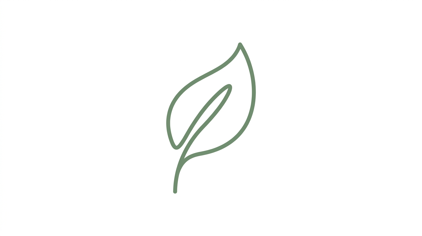
Single-line drawings reduce visual complexity and improve generation consistency. "Continuous line" is a specific art technique the model understands and reproduces well. Sage green reads as natural, organic, and health-adjacent without the overused bright green that feels generic.
Prompt: "Sleek fitness app logo, abstract human silhouette in motion, black and orange, dynamic and energetic, minimalist flat design, rounded square icon format, clean white background"
"Rounded square icon format" tells the model to constrain the composition to an app-icon shape. This is useful when you need a logo that works as a mobile app icon. The black and orange palette creates high contrast and energetic tension.
Vintage and Retro Logos
Vintage logos evoke nostalgia through ornate typography, warm color palettes, and design conventions from specific eras. Nano Banana 2 handles short vintage-style lettering when the text is kept to one word or a short name.
Prompt: "Vintage diner logo in badge format with retro script lettering reading 'JOE'S', neon sign style, red and chrome, 1950s Americana aesthetic, dark background"
Keep the text to one word or a short possessive name for best accuracy. "JOE'S" is better than "JOE'S ALL-NIGHT DINER AND GRILL." The badge format constrains the composition into a contained shape rather than letting elements float. "Neon sign style" is a specific rendering instruction that produces glowing edges and chrome-like reflections.
Prompt: "Retro barbershop logo with classic barber pole stripes, ornate serif typography, black and gold on cream, vintage sign design, hand-lettered aesthetic, badge shape"
Black and gold on cream is a historically accurate vintage barbershop palette. "Ornate serif typography" specifies the font category without requiring specific text, which lets the model render decorative letterforms. "Hand-lettered aesthetic" pushes toward organic, imperfect strokes rather than rigid digital type.
Prompt: "Vintage record store logo, bold serif typography with the word 'VINYL' in large letters, vinyl record motif, warm sepia tones, 1970s music aesthetic, textured paper background"
The single word "VINYL" in bold serif is within the model's reliable text rendering range. The warm sepia tones and textured paper background sell the retro aesthetic without requiring complex illustration. The vinyl record motif gives the model a strong visual anchor that is instantly recognizable.
Prompt: "Retro coffee roastery logo, hand-drawn illustration style, coffee bean detail in circular frame, brown and cream on kraft paper texture, artisanal craft aesthetic, established look"
"Circular frame" is a compositional constraint that produces contained, badge-style logos. "Kraft paper texture" as the background adds warmth and authenticity. "Artisanal craft aesthetic" pushes toward the small-batch, hand-made quality that coffee brands target.
Wordmark and Lettering Logos
Wordmark logos use the brand name itself as the primary design element. This category requires Nano Banana 2 because text accuracy is everything. The original model will produce garbled characters roughly 60% of the time.
Prompt: "Clean wordmark logo with the text 'ATLAS' in bold geometric sans-serif, black on white, minimal tracking between letters, professional and modern, typography-focused logo design"
"Bold geometric sans-serif" specifies a font category the model renders well. "Minimal tracking between letters" is a typography term that tells the model to keep letters close together rather than spacing them widely. Single-word names in ALL-CAPS of 5 characters or fewer are the sweet spot for reliable text rendering.
Prompt: "Fashion brand wordmark logo reading 'MUSE' in thin elegant serif with high contrast strokes, gold on black background, luxury and editorial, high-fashion typography"
"Thin elegant serif with high contrast strokes" describes the Didot and Bodoni style font families that fashion brands use. The high contrast between thick and thin strokes is a specific rendering instruction. "Gold on black" creates the luxury look that fashion brands favor.
Prompt: "Modern wordmark logo with the text 'NOVA' in rounded sans-serif, electric blue gradient on white, tech startup aesthetic, friendly and approachable, clean vector design"
"Rounded sans-serif" produces softer, more approachable letterforms than geometric sans-serif. The electric blue gradient adds dimensionality while remaining simple. "NOVA" at 4 characters is short enough for reliable rendering.
Prompt: "Retro wordmark reading 'BREW' in chunky block letters with inline detail, cream on dark brown, craft brewery aesthetic, hand-painted sign style, vintage typography"
"Chunky block letters with inline detail" specifies a vintage sign-painting style where letters have decorative lines inside them. This level of typographic specificity produces far better results than "vintage text" because it gives the model a concrete rendering target.
Monogram and Lettermark Logos
Monograms use initials as the primary mark. Single and double letters render most reliably because there is minimal text for the model to get wrong. This makes monograms the safest logo category for AI generation.
Prompt: "Elegant monogram logo with intertwined letters 'J' and 'M' in gold on deep navy background, luxury serif style, geometric interlocking construction, wedding or luxury brand identity"
"Geometric interlocking construction" tells the model how the letters should relate to each other rather than just placing them side by side. Gold on navy is the classic luxury color combination. The intertwined construction creates visual interest from just two characters.
Prompt: "Modern lettermark logo, single letter 'A' in geometric sans-serif with negative space triangle detail, black and white, minimalist, tech company identity"
Single-letter marks are the most reliable for AI text rendering: one character to render correctly. "Negative space triangle detail" uses the geometry of the letter A itself as a design feature. This is the kind of specific compositional instruction that separates a designed logo from a letter in a font.
Prompt: "Art deco monogram with letters 'R' and 'C' in ornate geometric style, gold and black, 1920s aesthetic, luxury brand identity, symmetrical composition"
Art deco is a well-understood visual style for AI models because it has strict geometric rules: symmetry, parallel lines, and repeating angular patterns. "Symmetrical composition" reinforces the deco aesthetic and constrains the output.
Prompt: "Minimalist tech lettermark, letter 'Z' in clean geometric form with sharp angles, electric blue on white, modern and sleek, app icon format, rounded square crop"
"Sharp angles" on the letter Z describes the natural geometry of the character and tells the model to emphasize it. "App icon format, rounded square crop" constrains the output to a specific, usable format.
Icon and Symbol Logos
Icon logos use imagery rather than text and avoid text rendering challenges entirely. This is the category where both Nano Banana and Nano Banana 2 perform equally well because no text is involved.
Prompt: "App icon design, simple mountain silhouette with sun rising behind peak, gradient from deep blue to warm orange, rounded square format, modern and clean, iOS app icon style"
"iOS app icon style" carries specific visual conventions: rounded corners, subtle gradients, and centered composition. The mountain and sun create a universally readable symbol. The blue-to-orange gradient adds visual interest while maintaining simplicity.
Prompt: "Eco brand symbol logo, abstract leaf form composed of three overlapping circles, green and earth tones, organic shapes, sustainable brand identity, flat design on white background"
"Three overlapping circles" is a specific geometric construction instruction. The model can reliably produce overlapping circles, whereas "abstract leaf" alone produces unpredictable shapes. Constraining the abstraction with geometry gives you creative results with consistent execution.
Prompt: "Tech company icon, abstract connected nodes forming a hexagonal network pattern, blue and white, minimal and geometric, professional, clean white background"
"Hexagonal network pattern" is more specific than "connected nodes" alone. Hexagons are a strong geometric primitive that the model renders reliably. The network pattern reads as technology, connectivity, and data, all without requiring any text.
Prompt: "Restaurant logo icon, crossed fork and knife in clean line art, warm terracotta and cream, rustic and welcoming, food brand identity, simple and iconic, circular background shape"
"Crossed fork and knife in clean line art" describes a specific composition and rendering style. "Circular background shape" constrains the layout. Line art as a style instruction keeps the output simple and scalable.
Brand Identity Mockups
Mockups place logos in real-world contexts: packaging, storefronts, business cards, and merchandise. These prompts are useful for client presentations, pitch decks, and social media content where you need to show how a logo would look in practice.
Prompt: "Product shot of craft beer can with minimalist label design, hop illustration and short brand text visible, wooden bar counter background, soft natural light, commercial product photography"
The beer can mockup tests how a logo works on a cylindrical surface with competing visual elements. "Wooden bar counter background" adds context without overwhelming the product. "Soft natural light" avoids the harsh studio look that makes mockups feel fake.
Prompt: "Coffee bag packaging mockup on kraft paper, minimalist circular logo stamp with coffee bean icon, brown and cream palette, flat lay on wooden surface, soft overhead lighting, artisanal brand presentation"
"Minimalist circular logo stamp" describes both the logo shape and the physical application method. Stamp-style logos on kraft paper are a specific aesthetic that the model handles well because the visual language is well-established in its training data.
Prompt: "Storefront sign for boutique clothing store, elegant serif lettering on black awning, urban street context, soft daylight, brand identity mockup, side angle showing depth of sign"
"Side angle showing depth" adds dimensionality that makes the mockup feel like a real photo rather than a flat composition. The black awning with serif lettering is a classic retail storefront look.
Prompt: "Business card flat lay with minimalist geometric logo, cream heavy cardstock, letterpress impression visible creating debossed texture, soft shadow, professional corporate identity, dark marble surface"
"Letterpress impression visible creating debossed texture" adds tactile realism that elevates the mockup from a flat image to something that communicates material quality. The dark marble surface provides contrast against the cream cardstock.
For more product-style mockup techniques, see our Nano Banana prompts for product photography guide.
Embossed and 3D Logo Effects
Embossed and 3D logos create the premium look of foil stamping, blind embossing, and metallic finishes. These prompts produce the kind of luxury brand imagery used in high-end packaging, business cards, and brand presentations.
Prompt: "Gold foil stamped logo on thick black paper, minimal geometric mark catching light at an angle, embossed texture with visible depth and shadow, luxury brand identity, close-up macro photography, soft directional light from upper left"
"Catching light at an angle" is the key instruction for foil stamping because the metallic surface changes appearance based on the light direction. "Visible depth and shadow" pushes the model to render the embossing as a physical effect rather than a flat graphic.
Prompt: "Silver embossed monogram on dark leather surface, single letter 'W' in classic serif with visible pressing depth, premium brand identity, macro detail shot, soft side lighting revealing texture"
Leather and embossing together create a tactile, luxury aesthetic. "Visible pressing depth" tells the model to show the letter as physically pressed into the leather surface. This level of material interaction is where Nano Banana's rendering strength shows.
Prompt: "Rose gold metallic logo on matte white surface, abstract geometric mark with brushed metal texture, luxury feminine brand identity, product photography style, soft even lighting, minimal and elegant"
"Brushed metal texture" specifies a surface finish different from mirror-polished or matte. Rose gold as a material instruction produces the warm pink-gold tone that luxury feminine brands use extensively.
Badge and Emblem Logos
Badge logos combine text, icons, and a containing frame into a self-contained mark. They work well for outdoor brands, breweries, sports teams, and organizations. The circular or shield-shaped frame constrains the composition and gives the model clear boundaries.
Prompt: "Outdoor adventure badge logo, circular format with mountain silhouette in center, pine trees at base, banner across bottom reading 'EXPLORE', earth tones with forest green and tan, vintage patch aesthetic"
The banner element is a classic badge convention that gives the text a specific location within the composition. "EXPLORE" at 7 characters in ALL-CAPS is within the reliable rendering range. The vintage patch aesthetic produces the embroidered, trail-worn look that outdoor brands use.
Prompt: "Craft brewery emblem logo, circular badge with hop flower illustration in center, ornate border detail, the word 'HOPS' on curved banner at top, green and gold on cream, artisanal and established"
"Hop flower illustration in center" and "curved banner at top" give the model a specific spatial layout. Badge logos benefit from explicit spatial instructions (center, top, bottom, border) because the model needs to arrange multiple elements within a contained space.
Prompt: "Sports team shield logo, angular shield shape with a stylized eagle in profile, bold contrasting colors of navy and gold, strong geometric lines, team identity design, no text, powerful and dynamic"
Shield shapes are well-understood geometric forms. "Stylized eagle in profile" gives a specific angle and level of abstraction. "No text" removes the text rendering variable entirely, letting the model focus on the illustration quality. This is the right approach when you plan to add team name text in post-production.
What We Found Testing 30 Logo Prompts Across Both Models
We generated 30 logo prompts across all eight categories on both Nano Banana and Nano Banana 2 on Morphed, scoring outputs on compositional simplicity, text accuracy, color discipline, and scalability.
Silhouette-first prompting is the single biggest quality lever for logos. Prompts that described the shape and composition before color or texture ("two overlapping triangles, black on white, flat design") produced logos that worked at small sizes in roughly 8 out of 10 generations. Prompts that led with style or mood ("cool modern professional tech logo") produced over-detailed results that failed at small sizes in 7 out of 10 outputs. The silhouette test is simple: if you squint at the output and the shape is not immediately recognizable, the logo does not work.
Nano Banana 2 text rendering is roughly double the accuracy of the original. Across all 30 prompts that included text, Nano Banana 2 rendered the specified text correctly in 8 out of 10 generations, compared to roughly 4 out of 10 with the original Nano Banana. The difference was most dramatic in wordmark prompts where text accuracy is binary: either the name reads correctly or the logo is unusable. For icon-only logos, both models performed comparably.
Color palette constraints improved output quality dramatically. Prompts that named exactly 2 colors ("black and gold") produced cohesive, professional-looking logos in 9 out of 10 generations. Prompts with 3 colors produced good results in 7 out of 10 attempts. Prompts with no color specification or vague color words ("colorful," "vibrant") produced logos with 4-6 random colors that looked like clip art in roughly 8 out of 10 outputs.
"White background" or "clean background" is a near-mandatory instruction. Without a background specification, the model places logos on patterned, textured, or environmental backgrounds in roughly 6 out of 10 outputs. A logo on a marble table or wooden desk looks like a product photo, not a brand asset. Adding "white background" or "black background" isolates the logo for immediate usability.
Flat design and vector-style instructions reduce unwanted detail. "Flat design" and "vector-style" each reduced gradients, shadows, and 3D effects. Without these instructions, the model often adds bevels, drop shadows, and glossy effects that make logos look dated and overly complex. The exception is the embossed and 3D category, where depth effects are intentional.
| Prompt Element | Impact on Quality | Best Practice |
|---|---|---|
| Silhouette-first composition | Highest | Describe shape before color: "two overlapping circles" not "cool modern logo" |
| Color palette constraint | High | Name exactly 2-3 colors: "black and gold" not "colorful" |
| Background specification | High | "White background" or "clean background" in every logo prompt |
| Text in ALL-CAPS with quotes | High | "Reading 'BREW' in bold sans-serif" not "with text on it" |
| "Flat design" or "no gradients" | High | Prevents bevels, shadows, and 3D effects unless wanted |
| Geometric shape instruction | Medium-high | "Hexagonal" or "circular frame" constrains composition |
| Font category naming | Medium-high | "Geometric sans-serif" or "ornate serif" not "nice font" |
| Logo format specification | Medium | "App icon format" or "badge shape" sets the aspect ratio and crop |
When AI Logo Design Is the Wrong Choice
AI logos are powerful for exploration, concept development, and rapid iteration. But they are not the right tool for every brand identity situation. Being honest about limitations saves time and prevents expensive mistakes.
Skip AI logo prompts when:
- You need a legally unique trademark. AI models generate from training data that includes existing logos. There is no guarantee that an AI-generated logo is sufficiently original to pass a trademark search. Before using any AI logo commercially, run it through the USPTO's TESS database or equivalent trademark registry. Two brands discovering they have similar AI-generated logos is a real and growing legal risk.
- You need precise vector output. AI logos are raster images (PNG). They cannot be scaled to billboard size without quality loss, they do not have editable anchor points, and they cannot be color-separated for print production. Any AI logo intended for professional use must be redrawn in a vector editor. Use the AI output as a reference, not a final file.
- Brand guidelines require exact color matching. AI models approximate colors. "Pantone 286 C" in a prompt will produce something close to that blue, but not the exact LAB values required for brand consistency across print, web, and merchandise. Final brand colors must be specified in your vector file.
- You are designing for a large organization with legal review. Enterprise brand identity projects involve trademark clearance, brand architecture, application guidelines, and multi-format deliverables. AI can accelerate the ideation phase, but it cannot produce the documentation and legal assurance that enterprise branding requires.
- The logo needs to include complex multi-line text. Taglines, addresses, and multi-word descriptions are unreliable. If your logo requires more than 4 words of text, generate the icon separately and add text in a design tool where you control every character.
5 Mistakes That Make AI Logos Look Like Clip Art
1. Too Many Colors Without a Palette Constraint
"Colorful logo" or "vibrant brand logo" gives the model permission to use 5-7 random colors, producing a rainbow mess that looks like a children's party invitation. Professional logos use 2-3 colors maximum. "Deep blue and white" or "black and gold on cream" constrains the palette and produces immediate visual coherence. Name exact colors, not moods.
2. Missing the Background Instruction
Without "white background" or "clean background," the model often generates the logo on a desk, a wall, a textured surface, or a gradient backdrop. The logo becomes part of a scene rather than an isolated mark. Every logo prompt should specify the background explicitly. For mockup shots, that is fine. For the logo itself, isolation is essential.
3. Vague Style Words Instead of Design Terms
"Professional," "modern," "cool," and "creative" are meaningless to the model. They produce inconsistent results because they have no specific visual definition. "Flat vector design, geometric sans-serif, no gradients" is three specific rendering instructions the model can follow. Replace every adjective with a concrete design term: "minimalist" means "simple geometric shapes, 2 colors, white background." Say the components, not the feeling.
4. Asking for Text Without Specifying It in Quotes
"Logo with the company name" produces random garbled letters because the model does not know what the company name is. "Logo with the text 'ATLAS' in bold uppercase" gives the model an exact string to render. Always put the desired text in quotes within the prompt. Without quotes, the model treats text as a concept rather than specific characters.
5. Over-Prompting with Competing Instructions
"Minimalist but also ornate and detailed with hand-drawn texture and clean digital vector style" is four contradictory instructions. The model cannot be minimal and ornate simultaneously. Pick one direction per prompt. If you want to explore multiple styles, generate separate prompts for each: one for minimalist, one for ornate, one for hand-drawn. Contradictory instructions produce muddled, confused outputs every time.
Prompt Construction Tips for Stronger Logo Results
-
Describe the silhouette first. Open with the shape: "two overlapping circles," "angular shield shape," "single continuous line leaf." If the shape does not work at 50 pixels, no amount of color or texture will fix it. Shape is the foundation of every functional logo.
-
Limit the color palette to 2-3 named colors. "Black and gold on cream" gives the model an exact constraint. More colors produce more chaos. Name specific colors (sage green, deep navy, warm terracotta) rather than categories (blue, green, warm).
-
Always specify the background. "White background," "black background," or "transparent-style clean background" prevents the model from placing your logo in an unwanted scene. This is the most commonly forgotten instruction.
-
Use Nano Banana 2 for any text. NB2 has roughly double the text rendering accuracy of the original. Use the original only for icon-only logos where no text appears.
-
Put desired text in quotes and keep it short. "Reading 'BREW'" gives the model an exact target. 1-4 words in ALL-CAPS is the reliable range. Anything longer should be added in post-production.
-
Include a design style keyword. "Flat design," "vector-style," "line art," "badge format," or "icon style" each carry specific rendering instructions. Without a style keyword, the model defaults to its own interpretation, which often includes unwanted effects.
-
Add "no gradients" for clean, scalable output. Gradients look good at screen resolution but complicate printing, embroidery, and small-size reproduction. Unless you specifically want a gradient, exclude it.
-
Generate 3-5 versions and compare silhouettes. Even with a good prompt, variation between generations is normal. Generate multiple versions and compare them at a small size. The version with the strongest silhouette is the one worth refining in a vector editor.
For poster and sign designs that use similar text rendering techniques, see our Nano Banana prompts for posters guide. For thumbnail graphics that require similar icon-first design thinking, check the Nano Banana prompts for thumbnails guide.
Frequently Asked Questions
What are the best Nano Banana prompts for logos?
The best prompts depend on the logo type. For wordmarks, use Nano Banana 2 with short ALL-CAPS text in quotes and specify the font style explicitly ("bold geometric sans-serif" or "thin elegant serif"). For icon logos, either model works since there is no text to render. For monograms, single or double letters render most reliably. Across all categories, the key technique is silhouette-first prompting: describe the shape and composition before color or detail, and limit the palette to 2-3 named colors. See the eight categories above for 30+ copy-paste ready examples.
Can Nano Banana render text accurately in logos?
Nano Banana 2 handles short text (1-4 words) with roughly 80% first-try accuracy, far better than the ~40% of the original model. ALL-CAPS text with common short words produces the most reliable results. Script fonts, long phrases, and non-Latin scripts remain unreliable. For logos with wordmarks, always use NB2 and generate 3-5 versions to pick the cleanest text rendering. For logos requiring more than 4 words of text, generate the icon with Nano Banana and add text in a vector editor.
Can I use AI logos for my real brand?
Use AI-generated logos for exploration, concept development, and direction-finding. For final brand logos, refine the best AI output in a vector editor (Illustrator, Figma, Affinity Designer) to ensure scalability, exact color matching, and legal uniqueness. AI logos are raster images that lose quality at large sizes, and there is no guarantee of trademark originality. Run any logo you plan to use commercially through a trademark search before committing. Treat AI logos as high-quality starting points, not finished deliverables.
What is the difference between Nano Banana and Nano Banana 2 for logos?
Nano Banana 2 offers dramatically improved text rendering: roughly 80% accuracy for short text versus ~40% on the original. For any logo that includes readable text (wordmarks, monograms, badges with banner text), NB2 is the clear choice. For icon-only logos without text, both models produce comparable results. NB2 also renders finer geometric detail more consistently, which benefits logos with intricate construction like interlocking monograms or detailed badge borders. Both are available on Morphed.
Do these prompts work with Nano Banana Pro?
Yes. Every prompt in this guide works with Nano Banana, Nano Banana Pro, and Nano Banana 2. Pro produces the sharpest geometric edges and most precise color reproduction, which benefits logos where clean lines and exact palette adherence matter. Nano Banana 2 delivers roughly 90-95% of Pro quality at faster generation speed, making it the best value option for most logo design use cases.
How long should logo prompts be?
Between 20 and 35 words. Logo prompts benefit from being shorter than other categories because simplicity is fundamental to logo design. A prompt with too many instructions produces a logo with too many elements. Structure your prompt in four parts: logo type and shape, the subject or icon, the color palette (2-3 colors), and the background. Prompts over 40 words cause the model to add detail that works against the clean aesthetic logos require.
Why do my AI logos look like clip art?
Three common causes. First, too many colors: constrain to 2-3 named colors. Second, missing a background specification: always include "white background" or "clean background." Third, vague style words: replace "cool" and "professional" with specific design terms like "flat vector design, geometric shapes, no gradients." Adding these three constraints fixes the clip art problem in most outputs.
Try These Prompts on Morphed
Copy any prompt from this guide into Morphed and generate your first logo concept in under a minute. Start with the icon and monogram prompts (they are the most reliable), then experiment with wordmarks and badge designs using Nano Banana 2 for text. Try different color palettes with the same composition to explore brand directions quickly.
More Nano Banana prompt guides: